Representing the outcomes of materiality assessments in a matrix is a useful and necessary way of communicating topics. There are a number of methods available and many, but not all, use a familiar essentially X-Y axis design to plot material priority.
Since the output from the assessment determines material targets and informs the sustainability strategy, the data can be represented as two matrices or can be combined depending on type.
Taking the GRI matrix as one example of how a matrix can be made, it has a horizontal axis that shows the importance, or lack thereof, of an issue to the company’s success. The vertical axis shows the importance of the issue to stakeholders. This level of importance will have been measured through the materiality assessment questionnaire.
Each mark represents the issue’s importance to both the company and the stakeholders. The least important issues are marked nearer the bottom left corner and the most important toward the top right.
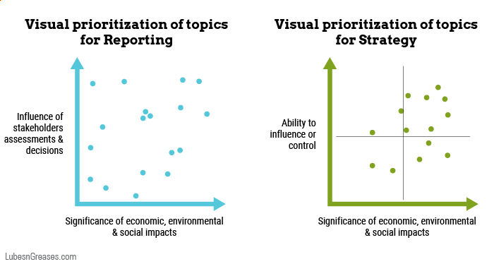
As Mia Overall, a sustainability consultant and founder of Overall Strategies, writes, “Putting everything on two axes can be overly constraining and mix things up.” She suggests plotting the issues to report and those to direct strategy on two matrices, as shown below.
The priorities for reporting then show the company’s impact, as shown in the figure on the left, as per the recommendations of GRI. The priorities for strategy, as shown in the figure on the right devised by Overall, illustrate its ability to influence them and therefore become opportunities.